Parallel coordinate plots (PCPs) are an interactive visualisation technique used to represent high-dimensional data in a two-dimensional space especially when checking for patterns and relationships. Each dimension of the data is represented by a parallel axis, and data points are plotted as lines connecting points on each axis. This allows for the visualisation and comparison of many outputs and variables simultaneously.
PCPs can be especially useful for:
Sensitivity Analysis and identifying key drivers: Understanding which input parameters have the most significant impact on a specific output. For example, when looking for "fan-out" patterns where a range of values on one input axis leads to a very wide range of values on an output axis (like EUI), that input is a highly sensitive parameter. Likewise "fan-in" patterns when a wide range of values on an input axis converges to a narrow range on an output axis, that parameter has less impact. This could be useful as part of an initial exploratory phase of design optimisation to help refine the range for variable values and which variables and outputs to include in any future analyses.
Identifying high-performance design solutions (optimisation): PCPs are excellent for sifting through very large design spaces to find combinations of parameters that meet multiple performance goals simultaneously. For example, when aiming for a near-net-zero building, the design team need to find design options that have a very low EUI, minimal discomfort/Unmet Load Hours, and a reasonable construction cost. The PCP allows users to select a desired range on one or more axes by brushing the objective, constraint or output axes, typically selecting the top-performing range. For example, highlight the bottom 10% of EUI values, the bottom 20% of construction cost, and the bottom 5% of Discomfort or Unmet Load Hours. The resultant plot will show which input parameter ranges correspond to these high-performance outcomes.
Understanding and visualising trade-offs: Building design inevitably involves making trade-offs. Improving one metric often worsens another. PCPs make these conflicting relationships obvious. See below.
Their ability to visualise high-dimensional data, reveal complex trade-offs, and enable interactive analysis makes them a powerful complement to other the other Insights display methods.
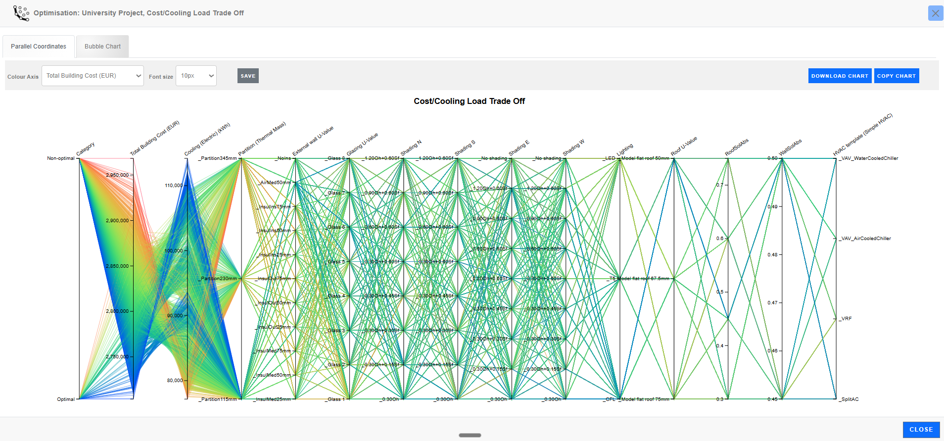
All data
As can be seen from the above diagram without any filtering, parallel coordinates plots can contain a lot of data and the clutter may not help with analysis. However, even in this unfiltered state they can provide visual clues to help identify correlations.
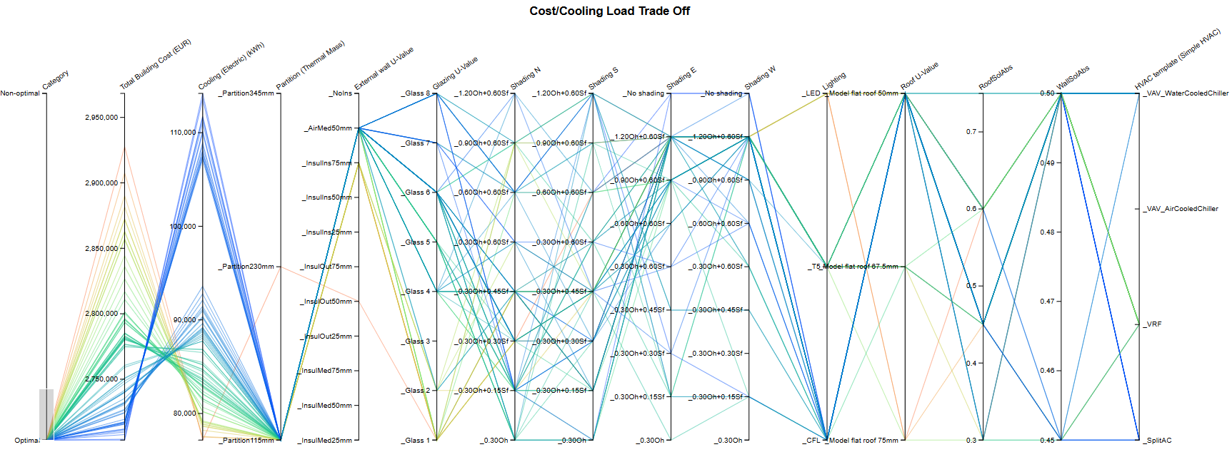
Optimal data only
The real value of these outputs becomes apparent when you start to explore the data by excluding potentially less interesting design options. For example, in the above output, it might help to limit the outputs to only the optimal ones. To do this, use the brush tool to select the "Optimal" Category only by clicking with the mouse on the "Category" axis just above the “Optimal” option, and dragging down to include the “Optimal” option and releasing the mouse button. Limiting outputs to only the optimal ones reduces the data significantly, as can be seen in the above diagram.
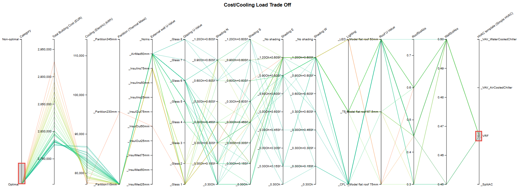
Optimal data with VRF HVAC system
Now limiting the outputs to include only design options with a VRF HVAC system further narrows down the results. See above.
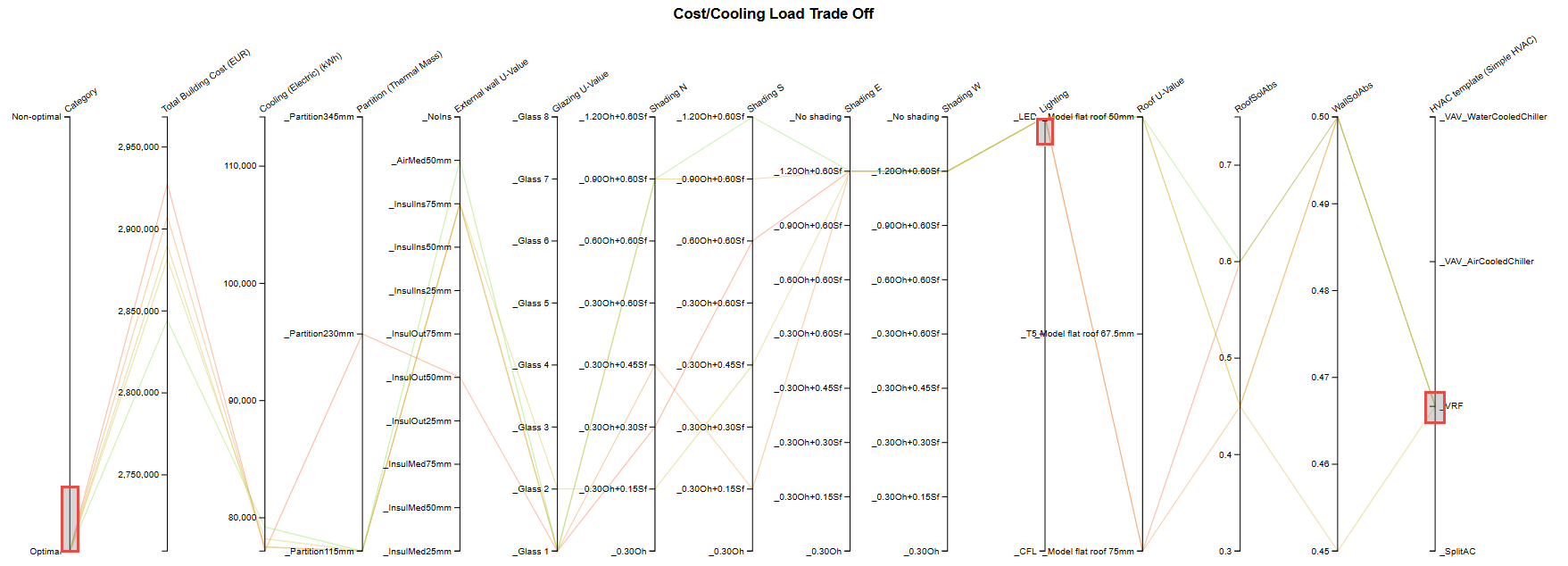
Optimal data with VRF HVAC system and LED lighting
Further limiting the outputs to exclude design options without LED lighting results in the above plot.
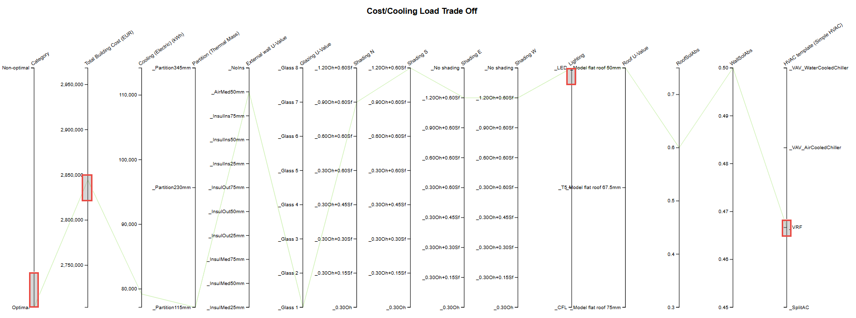
Finally, selecting the option with the lowest "Total Building Cost" from the remaining options results in the above plot with a single output.
This process is further illustrated in a video below.
Parallel coordinates plots with a lot of results can be cluttered and difficult to read. The best way to remedy this is by selecting subsets of the lines of greatest interest while hiding the others thus isolating the data points you’re most interested in. This is done by interactively "brushing" areas of interest on the plot using the mouse.
To do this, use the mouse to click and drag over one of the axes to define the intersecting design options of interest. You can do the same for any of the axes.
For brushes that have already been created, you can move these up and down by dragging with the mouse, or you can extend or reduce their range by using the mouse to drag the brush edges.
Tip: To clear brushing on any PCP Y-axis so that the full range of values are considered, double-click on the axis away from the existing brush. Alternatively, you can extend the brush size to cover the whole axis.
The process of creating and manipulating brushes is illustrated in the example video below which shows the steps described in the example above and additionally demonstrates how brushes can be resized and moved. Click on the maximise button for best clarity.
The horizontal panel at the top of the screen allows changes to be made to the following settings:
The Colour Axis control allows you to select which of the y-axes is used to colour the lines. In the above example, "Total Building Cost" is selected as the axis to be used to colour the lines representing the design options. This results in lines with the highest building cost being displayed in red, lines with lowest building cost being displayed in blue, and intermediate options being displayed in colours between red and blue on the spectrum.
Colouring the lines in this way can help identify any trends or correlations in the data. In the above example, most of the blue lines are positioned towards the top of the "Cooling (electric) (kWh)" axis, while most of the red and orange lines are towards the bottom. This indicates that the most expensive building options tend to give the lowest cooling and vice versa. In other words, there is a negative correlation between building cost and cooling electric energy consumption.
Select the font size to be used for all y-axis values and labels.

On the top panel, you can also find buttons to save settings and copy/download the chart.
These are described in more detail below.
Pressing the Save button retains the current set of options described above, so that when viewing the same chart next time, it will look exactly as it does now. Saving these settings does not effect on any other analyses or charts.
Pressing the Copy chart button copies the Parallel coordinates diagram onto the clipboard, ready for pasting into any document.
Pressing the Download chart button causes the currently displayed Parallel coordinates diagram to be downloaded as a png file into the Downloads folder on your local machine. The file is named using the analysis Name.