You can access a range of options from the top menu bar, toolbar and right-click context menus. Note that some commands are only available from the menu bar, others are only available from the toolbar and still others are only available from the context menu.
The Top menu bar has 3 top level entries:
The following menu bar commands are available:
New session
Open session
Save session
Save session As
Open datasets
Close dataset
Close all datasets
Save dataset as drb
RemoveHtml file
Exit
Restore Default Graph Styling
Options
Help
About
Creates a new session first closing any currently open session.
Opens a previously saved session file.
Save the current session to file.
Opens the Options dialog.
Use this option to load one or more new datasets into the current Results Viewer session. When you click on the icon and open Results Viewer, a file dialog appears. From here you can select files of the following types:
.eso - EnergyPlus results files in text format
.sql - EnergyPlus results files in SQLite format
.epw - EnergyPlus hourly weather files
.csv - Comma-separated value grid of data
.drb - Compiled Results Viewer data set
.json - JSON format grid of data
For more information on these file formats, see Results Viewer Supported Dataset File Formats
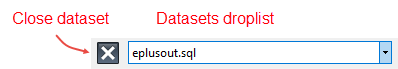
Use this option to close the currently selected data set as indicated by the text in the Selected datasets drop list immediately to the right. See screenshot below under Selected data set drop list.
If you have more than one dataset loaded, you can use the Selected datasets drop list (aka Dataset drop list) to select the current dataset.
When you use this control to select a new dataset, the available plots for the dataset are loaded into the grid on the left of the dialog.
Selecting this option causes the variables currently selected in the grid to be plotted on the current graph. The current graph can be identified by the different blue colour (see Selecting a graph). Single variables can also be added to the current graph by double clicking on the variable in the grid.
The same as Add selected variable(s) to current graph above but creates a new graph and plots the variable there.
Click this option to remove the selected variable(s) from the current graph. Single variables can also be removed from the current graph by double clicking on the variable in the grid.
The same as Add selected variable(s) to current graph above but plots equivalent variables for all datasets on the current graph. This option is only available when more than one dataset is loaded.
The same as Add selected variable(s) to current graph for all datasets above but creates a new graph and plots the variable there.
Click this option to remove the selected variable(s) from the current graph for all datasets.
Sometimes it can be useful to create a new plot by combining data from other plots. The Create Composite Plot dialog allows you to do this for selected plots.
This tool provides a quick way to export a set of results to a CSV file by directly selecting them from the grid without needing to first display them in a graph or grid.
Note: This gets around the 100 variable limit that applies to plotting data on the graphs and grid.
Display the data as a graph instead of a grid.
Display the data as a grid instead of a graph.
Allows you to save the data as a comma separated values (CSV) file for loading into a spreadsheet for further analysis.
Adds a new empty graph.
Removes the currently selected graph along with any variables that were plotted on it. Note that the underlying data is not deleted, just the graph.
Allows you to change the title for the currently selected graph. To change the name of the current graph right-click on the graph and from the DesignBuilder Options, select the Rename graph title option. Enter the title for the graph in the dialog and press OK.
If you have generated similar data for multiple frequencies then use this tool to use settings for the current frequency and display the same reports using a different frequency.
Change the text to be used for the main title for the graph.
Undo any zoom settings previously made.
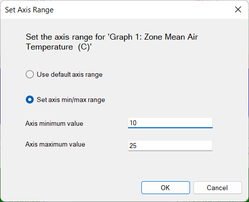
You can change the Y-axis range for the currently selected report from the Change Axis Range dialog which is accessed by clicking on this toolbar icon. By default the Use default axis range option is checked, in which case Results Viewer auto-scales the Y-axis based on the maximum and minimum values in all datasets that use the units of the selected dataset.
However the Y-axis range can be changed by clicking on the Set axis min/max range option and entering appropriate values for the Axis minimum value and Axis maximum value.
When exactly 2 datasets are displayed on a graph and there is only 1 graph, you can click on this toolbar icon to display:
the Comparison Metrics panel with summary statistical data indicating how well the modelled data fits with the reference or measured data, and,
the Difference bar.
See Data Comparison and Calibration for more information.
When 2 plots are being compared using the Compare datasets tool, one plot is considered to represent measured or reference data while the other is considered to represent the modelled data. Pressing this toolbar icon toggles the selection so what is currently the modelled data becomes the measured data and what is currently the measured data becomes the modelled data.