When first opening a Parametric Analysis dataset, you will see a line chart similar to the one below. By default, the settings should be similar to those used in DesignBuilder, so unless changes were made to defaults on the DesignBuilder Insights Upload Options Dialog, the default Insights bubble chart should look similar to that displayed in DesignBuilder, with the same X and Y-axes and Series.
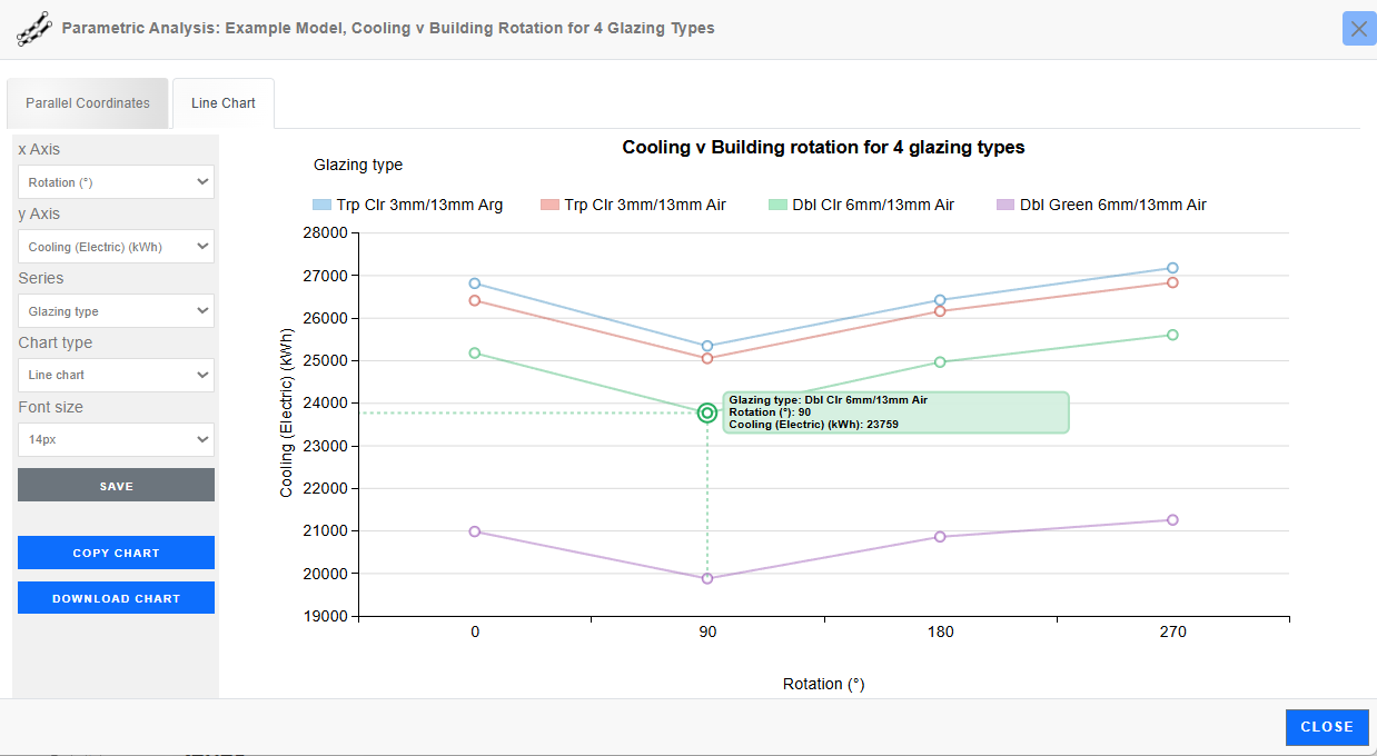
Moving the mouse over a data point provides a tooltip showing the X and Y-axis values and the Series value which, in the above case, defines the Glazing type. The tooltip is displayed in the same colour as that used to define the Series.
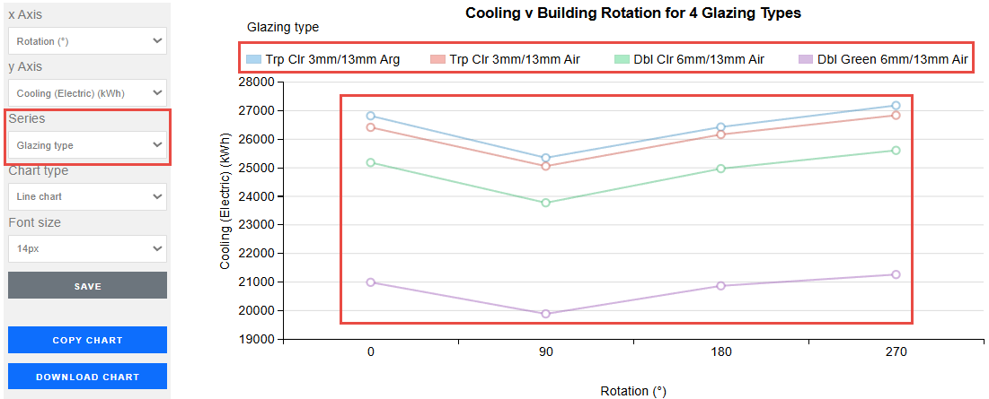
The panel on the left-hand side of the screen allows changes to be made to the following settings:
Select an Output, or a Design variable from the drop list to be used as the X-axis variable. Often, a Design variable will be used for the X-axis.
Select an Output, or a Design variable from the drop list to be used as the Y-axis variable. Often an Output will be used for the Y-axis.
The Series drop list allows you to select a non-numeric variable to define. This will be used to create one or more lines on the line plot each with a constant variable value. The range of series variable values will be displayed in the legend of the line plot. For example, if you select the series to be "Glazing type", the parametric analysis results will be displayed with a set of lines of different colours, one line for each glazing type option. The line colours are mapped to glazing type options in the legend. See below.
Choose from:
Line type, where a line is used to represent a set of values for each series.
Bar chart, where bars are used instead of points or bubbles to represent each value.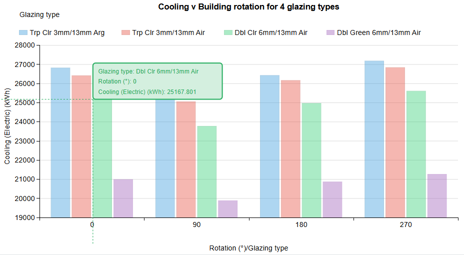
Bubble chart where bubbles are used instead of points or bars to provide an additional "dimension" through their size. The screenshot below shows an example where the bubble size is defined by the number of discomfort hours over the year.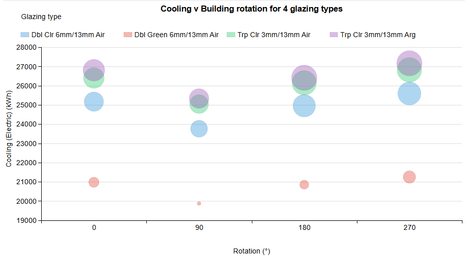
See above under Bubble charts.
See above under Bubble charts.