
When a dataset is loaded from a DesignBuilder simulation an eso and htm files are loaded and depending on the data that was generated in the simulation, the followed tabs may be available:
Timestep
Hourly
Daily
Monthly
Run period
Hourly Heat Map
Summary
Summary Charts
To show detailed results for a particular interval click on one of the tabs 1-6 in the list above. When clicking on one of these interval tabs you will see the Reports grid on the left of the screen containing a list of the available reports with data for the selected interval and a space to the right where the graph(s) are displayed.
The Reports grid includes several columns some of which are always displayed and others that are optional depending on settings on the Graph tab of the Options dialog:
Icon - a green icon with a tick is displayed here alongside any reports currently selected for display.
Report Type - the name of each report available for display is displayed in this column. These names are predefined by EnergyPlus and are unaffected by the language settings selected on the Options dialog.
Area - the name of the zone, HVAC component or other building element that the report refers to.
Schedule - if the report only excludes data for certain periods then the name of the schedule that controls the active periods is displayed in this column. This optional column is displayed only when the Schedules option is set to On or Auto and one or more reports have a schedule associated with them.
Units - the units that apply to this report on the graphs/grid to the right.
Source Units - the units of the report originally read in from the eso file which may be different from the units used in the display for energy and power reports and for most reports when displaying results in IP units. This optional column is displayed only when the Display original dataset units in grid option is selected.
Sorting the Reports can be a useful way to help find particular data and can be achieved by clicking on the column headers. For example to see data sorted by Area click on the Area header. This will collect together all data for each zone, HVAC component, Environment etc. in the list.
To plot a report on a graph, first select one or more reports on the grid by clicking with the mouse. Use <Ctrl>+left mouse click to add more reports to the selection set. Then use one of these methods to display the data:
If you have more than 1 graph set up you can select the current graph simply by clicking on it. You will see the graph heating highlight in a different colour blue when selected as shown below.

When you create graphs with Results Viewer, they are styled (e.g. Title Font, Background colour, etc) using a default styling template. You can change the styling defaults to your own preferences by using the right-hand context menu on the graph pane. The following options are currently available:
If you make some changes and want to revert back to the default styling at any time, select the Tools > Restore Graph Styling menu option.
Any styling changes made to the currently open session will be made permanent once the session has been saved.
You can load as many data sets as required to a single Results Viewer session by using the Open eso/Dataset menu or toolbar option. A list is maintained of all data sets currently opened in the Datasets toolbar drop list at the top of the window.

When you have more than one data set open it usually helps to Include the dataset name in the legend. This is set by default and can be controlled from the Options dialog.
In some cases you may find that too much data is displayed on the X-axis at one time and you need to focus on a section (time period) of the results graph. You can use the mouse to do this simply by dragging a time region of interest. This allows you to zoom in on data for particular days.
To return back to the original "un-zoomed" state, use the Undo zoom toolbar option.
To create a composite plot first select 2 or more reports of interest by left-clicking with the mouse. Hold the <Ctrl> key down when clicking to add new plots to the selection set.
Note: The Create Composite Plot toolbar is only enabled when 2 or more plots of the same units are selected.

Enter the name of the plot to be created. This name will appear in the Report Type column of the Reports grid.
Enter the area of the plot to be created. The Area represents the area of the building or environment covered by the new plot. This text will appear in the Area column of the Reports grid. For example if the new plot is the sum of a set of electricity consumption data for all zones then the area might be entered as "Building".
Data for the selected plots can be combined in one of two ways depending on the selection made in the Calculation type area of the dialog:
Average - in this case the values are averaged. Note that Results Viewer is not able to perform area or volume-weighted averaging as it does not data on the floor area or volume for the area of each of the source plots. If you need to create area or volume-weighted averages or apply some other more sophisticated method then new reports of arbitrary complexity that can be created using EMS scripts.
Sum - in this case the values are summed.
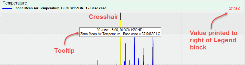
When you move the mouse over a point on a plot, a floating tooltip window appears with data for that point only. Left clicking with the mouse causes the value at that point to be plotted on the right hand side of the graph legend block and a black crosshair is displayed with a vertical and horizontal line centred on the point of interest. The crosshairs can be useful for checking simultaneous values for a range of reports. The value for all other reports currently plotted are also displayed for the current time indicated by the crosshair.
Tip: When the crosshair is displayed you can use the <Left> and <Right> arrow keys to scroll through the data.
When exactly 2 datasets are displayed on a graph and there is only 1 graph, you can click on the Calibrate toolbar icon  to display the Data comparison panel and the Difference bar. This provides some summary statistical data indicating how well the sample or modelled data fits with the reference or measured data. The screenshot below gives an example where 2 hourly weather datasets for the same location and year are compared. The blue line is for the most accurate "Actual" data based on hourly recordings and is used as the reference dataset and the red line is the sample "Design" dataset.

The Data comparison panel includes the summary statistical data listed below.
Measured - shows the colour of the plot that represents the measured or reference data. In the above screenshot the blue line in the reference data.
CV (RMSE) - the Coefficient of the Variation of the Root Mean Square Error, a metric that is used to calibrate models to represent measured building performance. It indicates how well the model is able to predict the target values (accuracy). Lower values indicate better fit and a value of 0 indicates perfect fit. ASHRAE Guideline 14 calibration criteria requires CV(RMSE) to be less than 15% for monthly data and less than 30% for hourly data. These are the default acceptance thresholds set on the Options dialog.
NMBE - Normalised Mean Bias Error indicates whether the data globally over or under-predicts relative to the reference values. Positive values indicate over-prediction and negative values indicate under-prediction and a value of 0 indicates perfect fit. It normalises the Mean Bias Error by dividing it by the mean of the reference values. ASHRAE Guideline 14 calibration criteria requires NMBE to be less than +/-5 for monthly data and less than +/- 10 for hourly data. These are the default acceptance thresholds set on the Options dialog.
R2 - the coefficient of determination is a standard statistical measure used to indicating how accurate a linear regression model is at predicting the reference data, i.e. how close the model data is to the fitted regression line. It is given on 0 - 1 scale, with a value of 1 indicating a perfect fit.
GOF - a standard statistical measure that determines how well the model data fits a distribution from a population with a normal distribution.
Tip: The Data comparison panel is initially displayed in the top left of the screen, but it can be dragged to a more suitable location as required.
When the Calibrate function is active, a Difference bar is displayed above the horizontal scrollbar at the bottom of the screen (see screenshot above). For each time interval on the graph a coloured band is displayed to indicate how close the model data is to the corresponding measured value. A red band indicates that the model data is lower than the measured and blue that it is higher. The shade of red/blue indicates the extent of the differences with darker colours showing greater differences. In large datasets (e.g. a year of hourly values) this display can help you to quickly find data that deviates the most from the measured values.